R and pandas library in Python
Diversifying sales and client communication into a wide array of chanels is a useful way to maximize profit through the improvement of Service Levels; «SL» is a rational and quantitative element which evaluates the peformance delivered to the customer base. In the incumbent endeavour, one is presented with a dataset rooted in a transportation company´s customer-order entrances; such entrances or chanels will be divided into three: Website message board, executives Emails, and a web whatsapp chat.
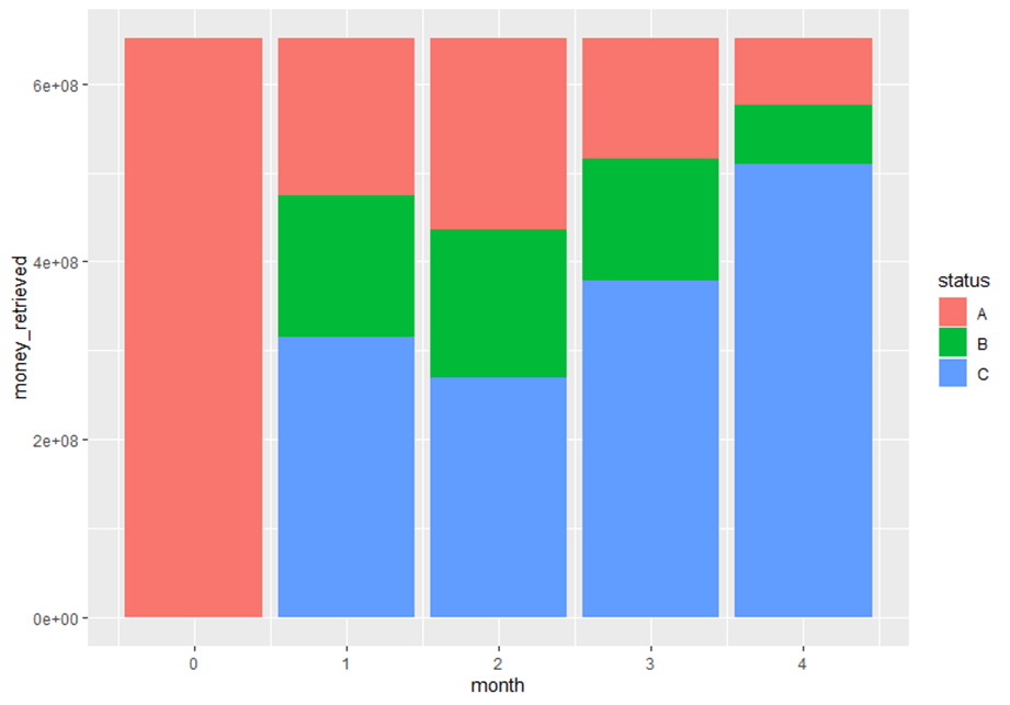
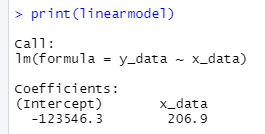
The dataset collection will follow a quite conventional sales report layout: a customer name, Tax id, number of order, date of registration, the executive assigned to the service request amongst other variables irrelevant to the scope of this examination. The data comprised stems from the period of July 2015 to June 2016. The key variable will be the «valor venta» column, which is spanish for sales value. Negative values will mean that the particular order was not fulfilled, the quotation was logged into the system with all the required parameters by one of the three chanels, but due to snags in the response procedure, the customer balked from the order; therefore generating an «opportunity» sale. The invoice value will differ greatly from one order to another, all freight services will have the port of Manzanillo, Mexico as its departure point and destinations will be strewn across the entire Mexican Republic,as for the cargo description, it could be a twenty-foot container, forty or LCL goods, hence the ample cost variation. As stipulated earlier, the desired outcome will be the comparison parameter named Service Level between the three entry chanels of the customer order. Sales variation depending on the first point of contact between the potential customer and the organization: «A» ,for website message board; B, for executives emails, lastly «C» for whatsapp chat run by a manager adjutant.
The service level will be nothing more than a quotient between the actual orders delivered and the total amount of orders entered into the system; simple addition of the opportunity sales and those already fullfilled.
Importing libraries
import pandas as pd
import datetime as dt
import numpy as np
With this chunk of code one obtains the preliminary look of the dataset sales_dataset=pd.read_csv(r'C:\Users\Alonso\Downloads\VENTAS CLIENTES.csv') 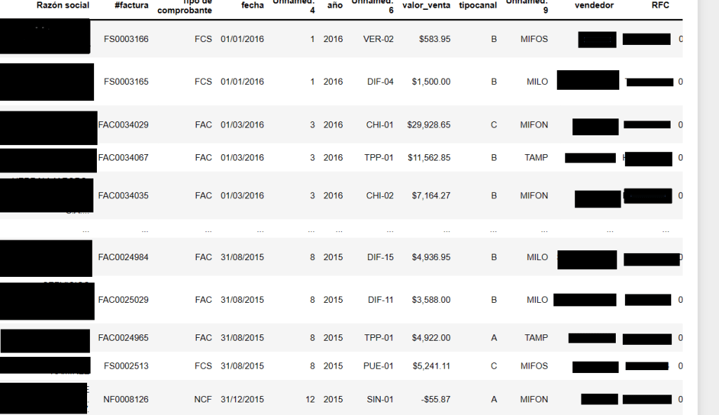
For the sake of fairness, one must be sure that the order input are equaly distributed amongst the three chanels . The ninth column from left to right- «tipocanal» spanish for chanel type- labels the entrance into the system («A», «B», and «C»).
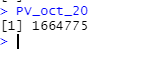
chanel_types_prop=sales_dataset_date['tipocanal'].value_counts(normalize=True)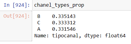
Perusing the first image, one sees that the eight column «valor_venta» or sales value has commas and the the $ mexican peso symbol. Both characters should be removed and transform into a float variable with a new column named ‘invoice_value’.
sales_dataset_date['invoice_value']=sales_dataset_date['valor_venta'].replace('[\$,]','', regex=True).astype(float)Next step will be to see the values behaviour across time with R Studio. This task will only require three columns of the prior dataset: «Date», «invoice_value» and «chanel type. It will be later transformed into a csv file.
sales_dataset_date_yr=sales_dataset_date[['fecha','invoice_value','tipocanal']]sales_dataset_date_yr.to_csv(r"C:\Users\Alonso\Desktop\doe3.csv")In R three libraries will be downloaded: lubridate, for date format transformation; dplyr, for manipulating the three imported columns, and ggplot2 for creating plots.
library(lubridate)
library(dplyr)
library(ggplot2)
doe3$month<-format(as.Date(doe3$fecha, format="%Y-%m-%d","%m"))
doe3$month<-month(doe3$fecha)
doe3$year_month<-format(as.Date(doe3$month),format="%Y-%m")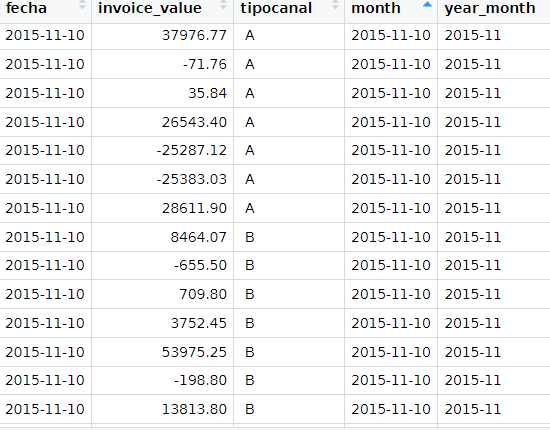
By applying the dplyr library, an average of actual services delivered and lost ones will be created in a monthly basis.
#Positive values
time_series_yr_ch<-doe3%>%
  group_by(year_month,tipocanal)%>%
  summarize(avg=mean(invoice_value))
#Negative values
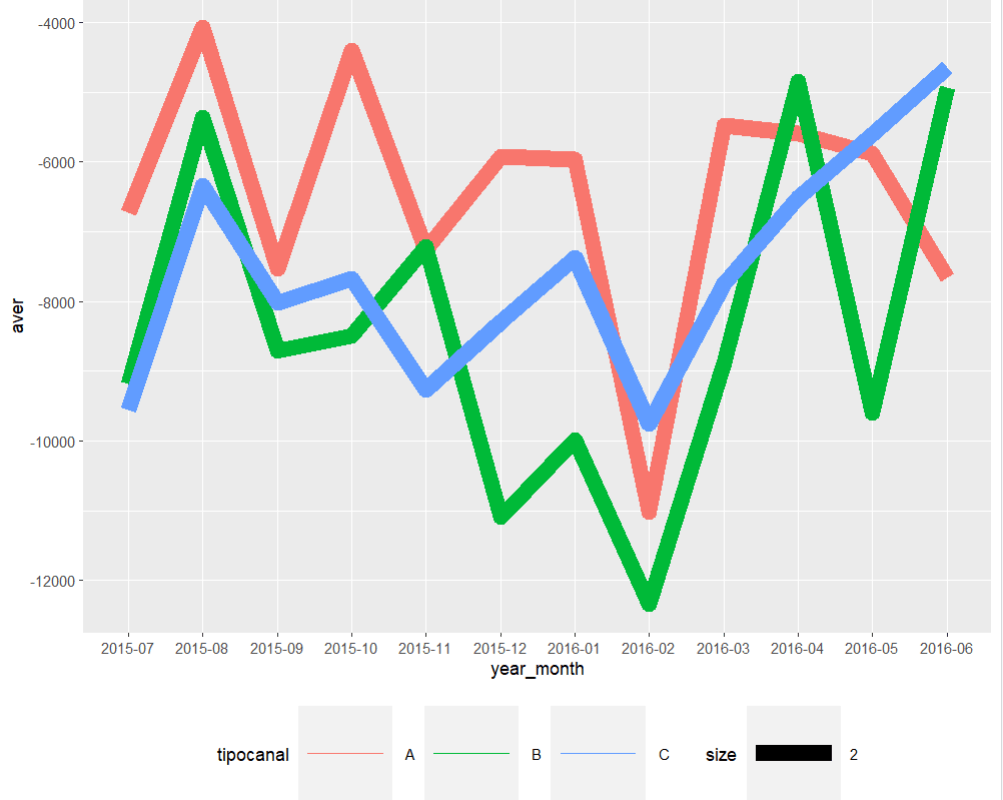
time_series_yr_ch_loss<-doe3%>%
group_by(year_month,tipocanal)%>%
filter(invoice_value< 0)%>%
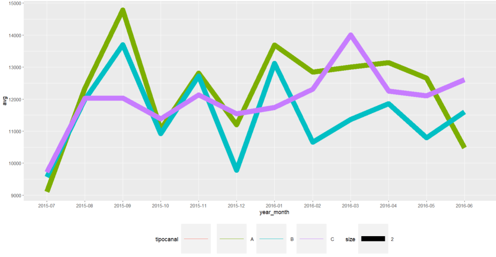
summarize(aver=mean(invoice_value))Time Series Plots
time_series_yr_ch%>% ggplot()+ geom_line(aes(year_month,avg, colour=tipocanal,group=tipocanal,size=2))+theme(legend.position = "bottom", legend.key.size = unit(2,'cm'),legend.key.height = unit(2,'cm'),legend.key.width = unit(2,'cm'))
time_series_yr_ch_loss%>% ggplot()+ geom_line(aes(year_month,aver, colour=tipocanal,group=tipocanal,size=2))+theme(legend.position = "bottom", legend.key.size = unit(2,'cm'),legend.key.height = unit(2,'cm'),legend.key.width = unit(2,'cm'))
In order to create a semblance of the required Service Level indicator an export of the R dataset will take place back into python through a csv.file
write.csv(b_chanel_sales,"C:\\Users\\Alonso\\Desktop\\b_chanel_sales.csv",row.names=FALSE)
write.csv(b_chanel_loss,"C:\\Users\\Alonso\\Desktop\\b_chanel_loss.csv",row.names=FALSE)
#One reintroduces the R datasets into python
b_chanel_sales_dataset=pd.read_csv(r'C:\Users\Alonso\Desktop\b_chanel_sales.csv')
b_chanel_sales_loss=pd.read_csv(r'C:\Users\Alonso\Desktop\b_chanel_loss.csv')
#Transform the opportunity values to positive ones by multiplying it times -1
b_chanel_sales_dataset['opp_sale']=b_chanel_sales_loss['negavg']*-1
With these to variables one can proceed to compute the service level, for instance in «B» chanel in a monthly basis.
# The Service Level quotient
b_chanel_sales_dataset['service_level']= b_chanel_sales_dataset['avg']/(b_chanel_sales_dataset['opp_sale']+b_chanel_sales_dataset['avg'])
In order to attain greater statistical formality, one should compare the three chanels in a same parametric basis. When reviewing the theoretical background, we utilize the Central Limit Theorem, which states that regardless of the distribution of a given dataset; if one extracts random units, proceeds to computes their means, repeats this process for a few iterations, such outputs will build a new dataset;which will follow a normal distribution. The following code example will demonstrate that.
# To remove emty values, we apply the following function:

sales_dataset_nna=sales_dataset_date.dropna()
The next step will be to create 2000 means from 5 random positive invoice values from each chanel, and insert them into an empty list. These values will generate the numerator for the Service Level quotient, and the same process will be carried out for the negative values; which added to the positive ones will equate the denominator.
sample_means_c=[]
for i in range(2000):
              sample_positive_c=sales_dataset_nna[(sales_dataset_nna['tipocanal'] == ' C') & (sales_dataset_nna['invoice_value']>0)]['invoice_value'].sample(5, replace=True)
             sample_mean=np.mean(sample_positive_c)
             sample_means_c.append(sample_mean)
The same for negative values.
sample_means_c_neg=[]
for i in range(2000):
    sample_negative_c=sales_dataset_nna[(sales_dataset_nna['tipocanal'] == ' C') & (sales_dataset_nna['invoice_value']<0)]['invoice_value'].sample(5, replace=True)
    sample_negative_c=sample_negative_c*-1
    sample_mean=np.mean(sample_negative_c)
sample_means_c_neg.append(sample_mean)service_level_numerator_c=sample_means_cservice_level_denominator_c=np.add(sample_means_c,sample_means_c_neg)service_level_c=service_level_numerator_c/service_level_denominator_cDeparting from the previous service level vector for each chanel, a recreation of the sampling process will take place by the application of the random function created for both the numerator and the denominator; this time applied to the Service Level quotient for the «C» chanel.
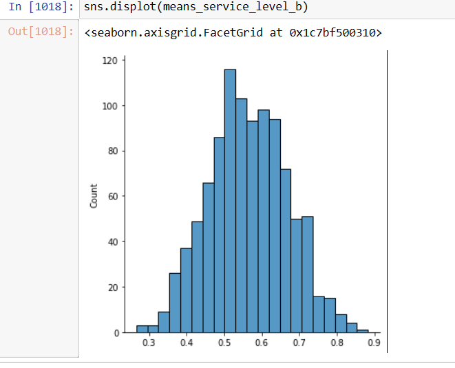
means_service_level_c=[]
for i in range(1000):
    c_service_prop_array=np.random.choice(service_level_c, size=5, replace=True)
    c_service_level_mean=np.mean(c_service_prop_array)
    means_service_level_c.append(c_service_level_mean)
To visualize the distribution of the previous means array, «means_service_level_c», one ought to plot a histogram in order to prove the apparent normality.
Displaying the Service Levels of the three chanels as Normal Plots
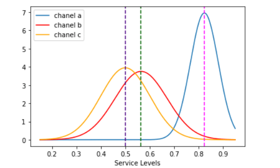
Arriving to the final stage of the research, one should plot three curves from the three different mean service levels using the standard deviation and the mean as defining parameters of the normal distribution.
As independent or x variable, we create an array from the lowest possible service level to the highest up to 95% with a length of 1000, proceed with the computation of the means and standard deviation for each chanel; labeling them as a_bar, b_bar, and c_bar respectively.
x=np.linspace(0.15,0.95,1000)
a_bar=np.mean(means_service_level_a)
b_bar=np.mean(means_service_level_b)
c_bar=np.mean(means_service_level_c)
Now, compute the probability density function with these four variables plus the «sd» or standard deviation.
norm_a=norm.pdf(x,a_bar,np.std(means_service_level_a))
norm_b=norm.pdf(x,b_bar,np.std(means_service_level_b))
norm_c=norm.pdf(x,c_bar,np.std(means_service_level_c))
With the probability density function and feature parameters, one can draw the three curves centered around their means named as «a_bar», «b_bar», and «c_bar» plotted also as dotted lines.
import matplotlib.pyplot as plt
sns.lineplot(x,norm_a,label='chanel a')
sns.lineplot(x,norm_b, color='red',label='chanel b')
sns.lineplot(x,norm_c, color='orange',label='chanel c')
plt.axvline(x=a_bar,color='fuchsia',linestyle='--')
plt.axvline(x=b_bar,color='darkgreen',linestyle='--')
plt.axvline(x=c_bar, color='indigo',linestyle='--')

plt.xlabel('Service Levels')
plt.show()
It is quite conspicuous that «A», or the website message board has the highest fulfillment rate and greater follow up of customer orders as it travels along the company´s system.
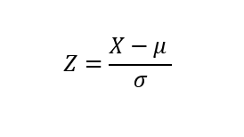
For the analysis to be framed in a more quantitative scope, z-score formula will be used to determine the spread between the three chanels . The «C» option, Whatssapp chat, will be the pivot point due to its further left value. How many «C chanel» standard deviations are the other two mean values swayed to the right ?
z_a_chanel_score=(a_bar-c_bar)/np.std(means_service_level_c)
z_b_chanel_score=(b_bar-c_bar)/np.std(means_service_level_c)
Computing this last chunk of code, one gets the distance of the «A» and «B» with respect to C. The former is equal to 3.17 sd and the latter is equal to 0.63. One can clearly state that those customer requests entering the system through the website message board will have a far greater chance of becoming income stream than those by email or whatsapp chat, both having practically the same service level (0.49 and 0.56).
A Service Level framework of thought is an optimal template for outlining business practices and align them with management goals, due to its panoramic view and its simplicity in terms of computation it is a fruitful primer for the inception of a Strategic Planing mindset. A/B tests are magnificent opportunities to design experiments that will enable the researcher to explore new alternatives that will yield greater returns or device improvements in the existing ones. The implementation of these tests will grant management with the necessary performance indicators to edify that goal oriented drive.