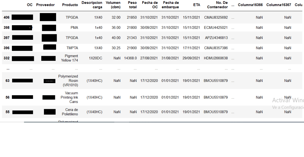
The following exercise involves information regarding Pacific sea freight operations of a mexican enterprise from the manufacturing sector. Due to confidenciality purposes, the dataset was construed through meager and rudimentary means; it was created by reviewing and manually capturing in a spreadsheet file the physical documentation from every purchase order (OC) carried out from November 2020 to October 2021, such as, invoices, packing lists, and Bills of Landing. Every record is a specific OC marked by its own denomination, Supplier, product name, description, Volume (cbm), total weight, Incoterm, invoice-value, Container number, dates (purchase, export, anchorage and plant arrival), whether its a FCL (20 or 40 footer) or less, amongst others.
The main drive for the building of this database was to keep track of every Asian imports docked in the port of Manzanillo, Mexico, and the subsequent analysis was elicited out of the chagrin stoked by all the pandemic turmoil in FBX01 index (Asia to North American West Coast) and its aftermath. The sudden elasticity of prices bore conspicuously upon the Company´s margins. Borrowing a loose 6 sigma template (Define, Measure, Analyze, Improve and Control), this case study will try to parametrize the stark fare fluctuations and rises through the employment of public data.
Firstly, we will sieve the messy csv-file through the R and pandas python library in a Jupiter environment with the purpose of determining the distribution of the goods, origin and a reasonable grasp for the entire collection.
import pandas as pd
import numpy as np
import matplotlib.pyplot as plt
po_dataset=pd.read_csv(r'C:\Users\Alonso\Desktop\compendium.csv')

#Now that we are able to read the file, we arrange the data by export date in an ascending fashion.
po_dataset_bydate=po_dataset[["OC","Fecha de embarque"]]
po_dataset_bydate=po_dataset.sort_values("Fecha de embarque",ascending=True)
# We need to know how much money amounts for the total dataset.
total_value=np.sum(po_dataset_bydate["Importe"])
value_tot_fcl=0
#A function will be required to read the entire file to divide the cargo between FCL and LCL, then divide its invoice percentagewise. Peering the file one notices that the main discriminator between both categories will be the instantiation of a lower or upper case «x»;therefore, two simple for loops will detect such character and add it to two different lists.
total_value=np.sum(po_dataset_bydate["Importe"])
value_tot_fcl=0
x=0
i=0
po_dataset["Descripcion carga"].apply(str)
po_dataset.set_index("Descripcion carga")
cargo_type=[]
fcl_dataframe_list=[]
lcl_dataframe_list=[]
for x in range(len(po_dataset)):
     a=po_dataset["Descripcion carga"][x]
     for i in range(len(a)):
    if(a[i]=="x" or a[i]=="X"):
        value_tot_fcl=po_dataset["Importe"][x]+value_tot_fcl
        fcl_dataframe_list.append(po_dataset["OC"][x])
        break
    else:
        lcl_dataframe_list.append(po_dataset["OC"][x])
fcl_dataframe=po_dataset[po_dataset["OC"].isin(fcl_dataframe_list)]
lcl_dataframe=po_dataset[po_dataset["OC"].isin(fcl_dataframe_list)]
value_tot_lcl=total_value-value_tot_fcl
data_prop={'fcl':[value_tot_fcl/total_value100], 'lcl':[value_tot_lcl/total_value100]}
percentage_dataframe_cargo=pd.DataFrame(data_prop)

full_perc=value_tot_fcl/total_value100 less_perc=value_tot_lcl/total_value100
#The output will be the following: 82% of the cargo is containerized amounting for $15,146,273.

#Graphic visualization
import matplotlib.pyplot as plt
plot_data=[value_tot_fcl,value_tot_lcl]
etiquettes=["FCL","LCL"]
plt.title("Type of cargo")
plt.pie(plot_data,labels=etiquettes,autopct='%1.1f%%', shadow=True,startangle=90)
plt.axis("equal")
plt.show()

#Because of the preponderance of Containerized cargo, all of the LCL goods will be ruled out of the study. Next, we will need to divide the data into a dataframe for all the full container dataframe.
def cargo_division(po_dataset):

        value_tot_fcl=0
        total_value=np.sum(po_dataset_bydate["Importe"])
        fcl_dataframe_series=[]
        for x in range(len(po_dataset)):
            a=po_dataset_bydate["Descripcion carga"][x]
            for i in range(len(a)):

                if(a[i]=="x" or a[i]=="X"):
                    value_tot_fcl=po_dataset_bydate["Importe"][x]+value_tot_fcl
                    fcl_dataframe_series.append(po_dataset_bydate["OC"][x])
                    break


        po_dataset_bydate.set_index("OC")
        fcl_condition=po_dataset_bydate["OC"].isin(fcl_dataframe_series)
        #lcl_condition=po_dataset_bydate["OC"].isin(lcl_dataframe_list)
        fcl_dataframe=po_dataset_bydate[fcl_condition]
        #fcl_dataframe["Fecha de embarque"]=pd.to_datetime(fcl_dataframe["Fecha de embarque"], format="%d/%m/%Y")
        #lcl_dataframe=po_dataset_bydate[lcl_condition]

        value_tot_lcl=total_value-value_tot_fcl
        data_prop={'fcl':[value_tot_fcl/total_value*100],
        'lcl':[value_tot_lcl/total_value*100]}
        fcl_dataframe["Descripcion carga"].apply(str)


        return fcl_dataframe

full_container=cargo_division(po_dataset)
#Output of the full container dataframe
#Graph of cargo: There is no much difference between both container types.
import matplotlib.pyplot as plt
plot_data=[value_tot_fcl,value_tot_lcl]
etiquettes=["FCL","LCL"]
plt.title("Type of cargo")
plt.pie(plot_data,labels=etiquettes,autopct='%1.1f%%', shadow=True,startangle=90)
plt.axis("equal")
plt.show()

Distribution by ports
All of the providers are located either in India or in China. The proceeding layer of analysis will be to review the percentage distribution of invoice-values within the departure ports.
#We create a function to extract all sales done through the FOB regime
FOBS=twenty_forty(fcl_dataframe)

def fob_incoterm(FOBS):
    FOB_dataframe=FOBS[(FOBS["Incoterm"]=="FOB")]
    return FOB_dataframe

fob_incoterm(FOBS) 
#Percentage distribution of the ports
fob_ports=fob_incoterm(FOBS)
port_counts=fob_ports["Puerto de Partida"].value_counts(normalize=True)
print(port_counts)
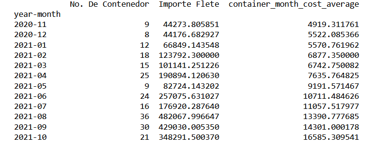
From the previous image, one can visualize that four ports account 85% of the total inventory. The next stage is the creation of a dataframe that will serve as a time series with two main parameters: total freight cost, and the number of containers on a monthly-basis.
#Transform fob_dataframe with the following parameters: for the indexation of the data series, one applies the «year-month» series; the count of units chartered per period, the number of single containers required; finally total freight expenditure .
fob_dataframe=fob_incoterm(FOBS)
fob_dataframe["year-month"]=fob_dataframe["Fecha de embarque"].dt.to_period('M')

container_counts=fob_dataframe.groupby(["year-month"])["No. De Contenedor"].count()
container_conts=fob_dataframe.groupby(["year-month"])["No. De Contenedor"].nunique()
container_conts_month_dataframe=pd.DataFrame(container_conts)
tot_freight_month=fob_dataframe.groupby(["year-month"])["Importe Flete"].sum()
total_freight_month_dataframe=pd.DataFrame(tot_freight_month)
#We write the function into a csv file.
print(container_quantity_totfreight_month_dataframe)
container_quantity_totfreight_month_dataframe.to_csv(r'C:\Users\Alonso\Desktop\container_quantity_totfreight_month_dataframe.to_csv')
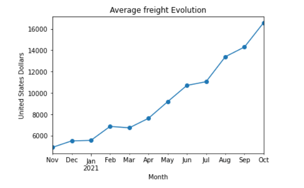
import matplotlib.pyplot as plt
average_freight_series_data=container_quantity_totfreight_month_dataframe["container_month_cost_average"]
average_freight_series_data.plot(x="year-month",y="container_cost_average",kind="line",marker="o")
plt.ylabel("United States Dollars")
plt.xlabel("Month")
plt.title("Average freight Evolution")
plt.show()
#Freight evolution per port.
container_tot_month.to_csv(r'C:\Users\Alonso\Desktop\ports.csv')
ports_plot_dataframe=pd.read_csv((r'C:\Users\Alonso\Desktop\ports.csv'))

ports_plot_dataframe.set_index('year-month',inplace=True)
ports=['Ningbo','SHANGHAI','Qingdao','NHAVASHEVA, India']
ports_plot_dataframe_limited=ports_plot_dataframe[ports_plot_dataframe['Puerto de Partida'].isin(ports)]
ports_plot_dataframe_limited.groupby('Puerto de Partida')['average_cost_freight'].plot(legend=True,subplots=False,marker='o',figsize=(20,20))
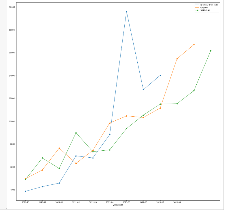
From the previous plot, one can appreciate how freight prices peaked around April and May 2021, for the particular west indian port of Nhava Sheva, as a probable direct consequence of the Evergiven Incident that took place at the end of March.
Departing from the aforementioned broad and explanatory strokes, one ends up with several misgivings stemming out of the ricocheting prices without prior notice. Retaking the initial proposition, the conundrum will be framed within the Six Sigma methodology; beginning with a problem statement: In less than 10 months, we have seen the doubling of the Pacific rate, which will percolate into the tax and duties paid at mexican territory, and eventually chafe companies margin.
The pretension will be to find a macroeconomic factor that will endow analysts a reasonable forecast for further periods; such factor, will be the issuing of currency. Following a conservative lecture on monetary theory, one learns that an increase in money supply will crank up inflation across all goods and services. Given the North American location of the port of Manzanillo, one can assert that the USA exerts single handedly the most overwhelming influence upon the FBX01 index; thus, one can surmise that its monetary policy will be the most crucial fare driver within the scope of this case-study, also, its a well espoused fact that during the pandemic, the government added 3 trillion dollars into circulation; this influence will be tested in the form of money creation during the data set timeline; this data will be extracted from the fred.stouisefed.org website.
Measure: Linear regression model
For the second stage of the Six Sigma praxis, a linear equation will be created; utilizing the average container fare per month as a response variable and the monetary mass as predictor or independent variable. The model mechanics will be to compare the current average container price with the monetary mass of the previous month. In order to have more manageable information and less difference in orders of magnitude, the monetary mass will be measured in a per-capita basis using a total population of 329500000.
#Data transformation for the model
usd_circulation_data=pd.read_csv(r'C:\Users\Alonso\Desktop\usd_incirculation.csv')
from matplotlib.legend_handler import HandlerLine2D
us_population=329500000
usd_circulation_dataframe=pd.DataFrame(usd_circulation_data)
usd_circulation_dataframe["monetary_mass_per_citizen"]=usd_circulation_dataframe["currency_emission"]/us_population
usd_per_capita=usd_circulation_data.monetary_mass_per_citizen
month=usd_circulation_dataframe.month
print(usd_circulation_dataframe[["month","currency_emission","monetary_mass_per_citizen"]])
monetary_mass_plot=usd_circulation_dataframe.plot(x="month",y="monetary_mass_per_citizen",kind="line",marker="o")
plt.ylabel("USD")
plt.xlabel("month")
plt.title("Monetary mass per person")
plt.legend(handler_map={monetary_mass_plot:HandlerLine2D(numpoints=13)})
plt.show()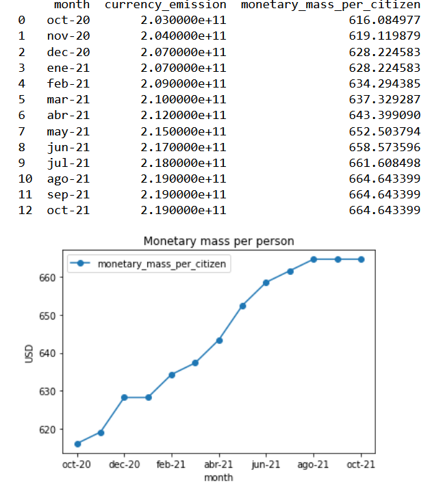
#Visual correlation of the two variables
freight_predictor=np.array([average_freight_series_data])
independent_variable=np.array([usd_circulation_dataframe["monetary_mass_per_citizen"][0:12]])
plt.scatter(independent_variable,freight_predictor)
plt.ylabel("Price per container(thousand dollars)")
plt.xlabel("money supply per capita")
plt.title("Scatter Plot:Container-Freight price/monetary mass supply")
plt.show()
Model in Rstudio
x_data<-x_variables$monetary_mass_per_citizen
y_data<-y_variables$container_month_cost_average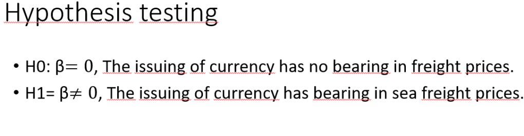
linearmodel<-lm(formula=y_data~x_data)
print(linearmodel)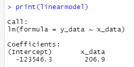

With the previous p-value, we can reject the Null hypothesis and conclude that the printing of money does have an impact upon freight prices.
Analyze
In this part, the model´s statistical rigour and validity will be put to a test by evaluating the output parameters. Initially, we have the Adjusted R-squared value: .9008, this tells us that the monetary input per capita explains 90% of the freight fare variation, so we can conclude that the model is quite optimal.
Testing the assumptions of the model :
Normality of the residuales
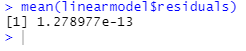

From the previous mean of the residuals and histrogram, one can concludes that it follows a normal distribution, as most values cluster around the mean.
Homocestaticity
At this point, one tests whether the residuals and the fitted values have the same variance.
var.test(linearmodel$residuals,linearmodel$fitted.values)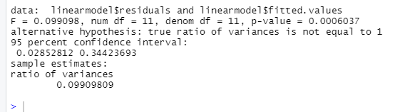
Given this last output, one can conclude that the model is not rigorous enough by having a confidence interval different than one.
Improve
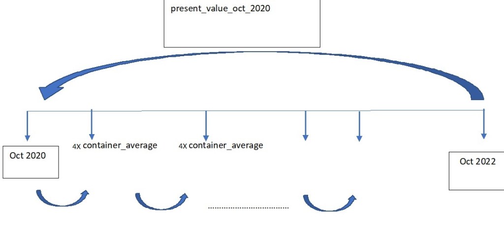
Proceeding with the monetary reading referred to earlier, after a period of bustling consumption like the experienced during the en masse printing of money of the last months ; subsequently applied policy is the escalation of interest rates in order to incentivize savings. The inextribable links between United States and Mexico alluded in the FBX01 index are also shared with the interest rate positions. On this improve section, the purported goal ought to be the acquisition of a treasury bond product that will have provided the company with a hedging slack against stark price shocks. To assess the effectivity of this stratagem, two vectors will be created; the first one involving the total expenditure per month incurred; second the interest rates for every month in the previous vector (researched from the internet). All of this expenditures will be taken to a October 2020 in a present value basis, which is exemplified by the following image.
Create an R vector utilizing the csv file, «container_quantity_totfreight_month»
vector_container_cost<-c(container_quantity_totfreight_month_dataframe$Importe.Flete)
print(vector_container_cost)
Create discount factor:
i<-c(0,.0448,.0448,.0452,.0428,.0428,.0428,.0452,.0451,.0475,.0475,.04997)

discount_vector<-(1+i)^-(1:length(i)-1)
discount_vector
Define Present value for October 2020
PV_oct_20<-sum(discount_vector*vector_container_cost)
PV_oct_20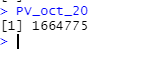
We get a total logistical cost at an October 2020 value of 1664775.00 USD.
Financial Product
As stated in the Improvement core, one intends to buy treasury that could be monthly compounded from October 2021 to October 2022. The amount invested should be defined from the results of the analysis. As an initial step, one gets the total amount of container employed in that year.
sum(container_quantity_totfreight_month_dataframe$No..De.Contenedor)
The October present value will be divided by this last factor as a straightforward container average value, which results in 7465.35 USD
By investing the equivalent of 4 containers every month and allow it to compound with the interest rate vector, just as the cash flow diagram above.
future_value_oct_22<-function(amount,i){
  p_0<-0
  for(i in (i)){
    payment_period<-p_0+amount
    value_investment<-payment_period*((1+i)^1)
    p_0<-value_investment


  }
  return(value_investment)
}
Finally, this last value should be discounted to the October 2020 base line; once that both parameters have the same time frame, we can determine the percentage of effectivenes reached with this simple hedging mechanic.
present_value_saved_oct_2020<-function(future_value_from_product,i_1,i_2){
  total_interest_vector<-append(rev(i_1),rev(i_2),after=length(i_1))
  fv<-future_value_from_product
  for(i in (total_interest_vector)){
    p_value_oct_20<-(fv)*(1+i)^-1
    fv<-p_value_oct_20

  }
  return(p_value_oct_20)
}

present_value_saved_oct_2020(future_value_oct_22(7465.359*4,i_2021),i_2021,i_2020)

From an overall logistical cost of $ 1664775, we were able to hedge 9.23% applying this treasure bond policy within a single year.
Conclusion
Radical and unpredictable freight ascensions are ineluctable, as their impact upon utilitarian indicators; yet one must strive to glean useful tools that will grant analysts with windows for visualizing these menacing tides. Albeit the statistical invalidity of the model, the macroeconomic variable of choice, «monetary mass per capita», does have a strong positive correlation with our objective variable. For the final Control stage, one sugests a periodical review of the currency emission, which will provide useful foresight and its consequential effect on interest rates will parsimoniously muffle these margin strikes for the immediate year.
